
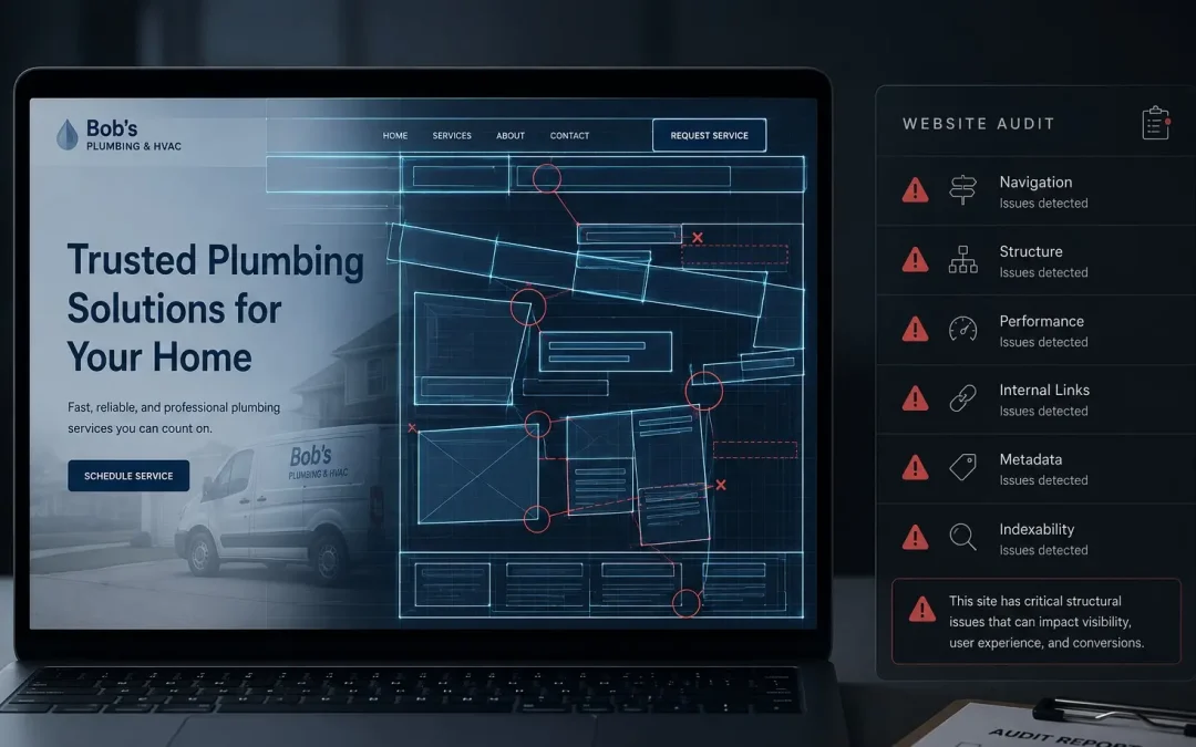
Post Summary: What a Three-Minute Screen Share Turns Up
Across the last fifty small business sites we looked at, the heading structure was right on fewer than five. Nine in ten got it wrong, on the one thing a search engine reads before any of the writing. Four faults come up over and over: more than one H1 on a page, levels jumping around out of order, share buttons and sidebar widgets coded as headings, and whole sections demoted to H3 that should be carrying H2 weight. Past the headings, the check moves to pages: whether the ones that should exist do, whether each service has its own rather than sharing one, and whether anything live is sitting empty.
One insurance agent’s page carried a jumble of heading levels in no discernible order. One of those H2s promised what happy clients had to say, above a section containing nothing at all. The reviews existed. Seventeen of them, averaging 4.9 stars, sitting on Google where nobody had thought to move them across.
Below: what a scan cannot see, and why the whole thing costs nothing and ends without a pitch.
We Run These Audits Almost Every Day
Of the last 50 websites we’ve audited for small business owners, fewer than five had their heading structure set up correctly. That’s a 90% failure rate on something Google reads before it reads a single word of your content.
We run website audits for prospects almost every day. No 40-page PDF. We share your screen, pull up your site, and walk through what’s working and what’s costing you leads in real time. The whole thing takes two or three minutes. Here’s our website audit checklist, what we check and why it matters.
First Look: Does the Site Feel Like You?
Before we touch a single tool or look at any code, we ask one question: does this website feel like every other website in your industry, or does it feel like your business?
Most of the time, the answer is the first one. Generic stock photos. A color scheme that doesn’t match the logo. Layout templates that look identical to three competitors on the same street. The site functions, pages load, links work, but there’s nothing that says “this is us.”
That first impression matters more than people realize. A visitor who lands on a generic-looking site makes a snap judgment about the business behind it. If the site looks like it was built from a template and never customized, the assumption is that the business operates the same way.
We’re looking at colors, imagery, and whether the brand identity carries through from the logo to the footer. If someone handed you this website with the logo removed, could you tell whose business it belongs to? If the answer is no, that’s the first problem.
The Heading Hierarchy Check
This is where things get technical, but it’s also where the biggest invisible damage lives.
Every page on your website has headings, H1, H2, H3, and so on. These aren’t just visual formatting. They’re a structural map that tells Google what the page is about, what the major sections cover, and how the content is organized. When the heading hierarchy is wrong, Google is reading a table of contents that makes no sense.
We use a Chrome extension that shows us every heading on the page, in order. Here’s what we typically find:
- Multiple H1 tags. Your page should have exactly one H1, it’s the page title, the primary topic signal. When a page has three H1s, Google doesn’t know which one defines the page.
- Heading levels that skip around. An H2, then an H4, then back to an H3. It’s like a book where chapter 2 jumps to chapter 7 then back to chapter 4. Google’s parsers expect logical hierarchy.
- Non-content elements tagged as headings. Share buttons, sidebar widgets, footer labels, all coded as H2s or H3s. This dilutes the heading structure with noise that has nothing to do with the page’s topic.
- H3s that should be H2s. Major content sections buried under H3 tags instead of H2s. This tells Google those sections are subtopics of something above them, even when they’re standalone subjects that deserve full heading weight.
The insurance agent’s site we looked at this week had one H1, two H2s, thirteen H3s, and three H4s, with no logical order. One of the H2s was “Here’s what our satisfied clients are saying.” The section below it was completely empty. Not a single review. The other H2 was a social share button. Thirteen H3s were scattered across the page with labels that barely related to insurance.
Meanwhile, this agent has 4.9 stars and 17 reviews on Google. Real reviews from real clients, sitting right there on their Google Business Profile. But the website has a massive review callout section with zero content, and it’s been sitting that way long enough to be indexed.
Content and Page Structure
After headings, we look at whether the pages that should exist do exist, and whether the pages that do exist make sense.
A service business with six service lines but only one “Services” page is leaving money on the table. Each service should have its own page with targeted content, because each service is a separate search opportunity. A roofing company that lumps “residential roofing, commercial roofing, roof repair, and gutter installation” onto one page is competing for four keywords with one URL. A company that gives each service its own page competes four times. This is one of the reasons a well-built website design pays for itself, the structure alone creates ranking opportunities. It also sets the foundation for what you’ll see when you review your site for the first time; understanding what to expect from a website mockup helps you give better feedback at that stage.
We also check for pages that exist but shouldn’t, or pages that exist but are empty. That insurance agent had a dedicated reviews page on their site. Zero reviews on it. The page was live, indexed by Google, and actively hurting their credibility. An empty reviews page is worse than no reviews page at all, because it implies nobody has anything good to say.
What the Tools Can’t Tell You
There are audit tools that can scan your site and generate a report in seconds. They’ll flag broken links, missing meta descriptions, slow load times, and image sizes. Those tools are useful for what they measure, but they can’t measure what matters most.
No tool can tell you whether your homepage makes a visitor feel confident about hiring you. No tool can flag that your review section is empty or that your heading structure tells a nonsensical story to Google. No tool can look at your site and say “this doesn’t feel like a real business, it feels like a template.”
That’s where the human audit matters. A real website audit checklist isn’t a software scan, it’s a trained eye combined with technical knowledge. When we screen-share with a prospect and walk through their site in real time, we’re combining both with something no crawler has: judgment. We’ve built 300+ sites and audited hundreds more, which is where the judgment comes from.
And here’s the part most people don’t expect: we do this for free. No strings, no pitch at the end, no “here’s what we found, now pay us to fix it.” We walk you through what we see, explain what it means, and let you decide what to do with that information. If that means hiring someone else to fix it, that’s fine. The audit has value regardless of who does the work. If it surfaces issues that need a full rebuild, what happens on website launch day gives you a clear picture of how that process ends.
Why Most Business Owners Don’t Know
The most common reaction we get during an audit is surprise. Not because the problems are obscure or deeply technical, but because nobody ever told them.
Nobody flagged the empty review section. The heading hierarchy never came up when the site was built. An automated report arrived at some point, heavy on jargon and light on what any of it meant for the business. Part of the problem is that most business owners don’t know what good communication from a web design team is supposed to look like, so the silence reads as normal. If any of this sounds familiar, you’re not alone.
When you’re met with irrational resistance after showing someone exactly what’s wrong with their site, you just have to move on and wait until they’re ready. Not everyone is ready to hear it. But the ones who are, the ones who look at their site through fresh eyes and see what it isn’t doing, those are the people we can help immediately.
It takes about three minutes, costs nothing, and you’ll walk away knowing exactly where you stand, whether you work with us or not. That’s what a website audit checklist should do: give you clarity, not a sales pitch.
Frequently Asked Questions
How long does a website audit take?
Two to three minutes on a live screen share. We pull up your site, walk through the key issues, and explain what each one means for your business. No long reports, no jargon-heavy PDFs, just a straight conversation about what’s working and what isn’t.
What tools do you use during an audit?
A Chrome extension that maps heading structure and our own eyes. We manually click through pages, check links, review content, and assess the overall user experience. Automated tools miss the things that matter most, like whether your site builds trust or undermines it.
Do I have to pay for a website audit?
No. Our audits are free with no obligation. We show you what’s there and the decision is yours. If you hire someone else to make the fixes, that’s perfectly fine.
What’s the most common problem you find?
Heading hierarchy issues, specifically, H3 tags used where H2s should be, non-content elements coded as headings, and pages with multiple H1 tags. These are invisible to the business owner but directly affect how Google understands and ranks the page. The other major issue is contact forms that silently lose leads through deliverability failures.
What do you look for that a tool wouldn’t?
Most of the technical checks aren’t exotic. Any competent web professional would spot the same issues. What takes attention is the thing sitting in plain sight for a year, like a review section with nothing in it, on a page that loads fine and passes every automated scan. That’s what a person catches and a crawler doesn’t.